The Professional
Women's Sportswear
The Professional
Women's Sportswear
.png)
iHealth and Wellness Foundation
Optimizing Survey Interfaces for Complex Diseases Patients
DURATION:
2023- 2024
PLATFORM:
Responsive Web for Desktop, Tablet & Mobile
MY ROLE:
Product Designer
TOOLS:
Figma, Trello
BACKGROUND
Help patients with complex diseases
iHealth and Wellness Foundation is an online medical and wellness care platform specifically designed for patients with complex diseases. It offers a dual-network system that connects these patients with healthcare and wellness providers. Based in New York City, iHealth and Wellness Foundation is an early-stage tech startup currently gearing up for a proof-of-concept launch.
PROJECT OVERVIEWS
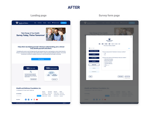
Optimize survey pages to help match clinical trials for patients
The iHealth and Wellness Foundation platform, offering complex information and features. We've mainly focused on developing the Medical & Wellness Provider Lookup, which allows booking appointments and visiting doctors. However, due to limited resources and staffing, improving and deploying the survey page design hasn't been prioritized. It's crucial to optimize these survey pages soon to assist patients with clinical conditions in finding the most suitable clinical trials for their needs.
SOLUTION
Key points to improve Survey Pages Design
-
Simplify the survey interface with a clean, easy-to-read layout
-
Implement a clear and intuitive navigation system
-
Incorporate visual aids
-
Ensure mobile optimization
-
Conduct testing and iteration
Impact And Deliverables
What are the final outcomes and improvements?


-
Created 15 screens each for desktop, tablet, and iPhone.
-
Built 6 variations for initial wireframes.
-
Conducted 4 user testing sessions.
-
Completed 8 rounds of iteration for high-fidelity design.
-
The Redesign Pages will be delivered for publication in 2024.

User Research
How did I analyze old design and consolidate user needs?
HEURISTIC EVALUATION
The problems on old survey pages
I analyzed the old design using heuristic and LATCH methods, following the 10 Usability Heuristics (Source: NNGroup), and the Basic Principles of Design. Below are the main problems that I believe need to be solved.

PROBLEM #1
No User-centricity
Irrelevant content doesn't consider the user’s needs and what they want from the product.
FOR EXAMPLE
The landing page doesn't explain well what the survey for and why users need to take the survey, including the irrelevant images.
IMPACT
Non user-centric design will lead to low conversion rate.
PROBLEM #2

No Visibility of System Status
Users are unsure when the survey will end, even when there are not many questions, which in turn increases the drop off rate.
FOR EXAMPLE
There is no information to keep users informed about their current status or what is happening during a given interaction, leaving them uncertain about their next steps.
IMPACT
Without instant feedback, the design becomes unpredictable, causing users to lose guidance and trust.
PROBLEM #3
Low Visual Hierarchy
Low visual hierarchy doesn't help users navigate the product as doesn't draws attention to the most important pages and elements, and they can't easily find what they need.
FOR EXAMPLE
There is lack of emphasis and direct attention on important elements, like the font size is too small, options of answers are not aligned well.
IMPACT
Low visual hierarchy will be inefficient use experience which results in low completion rate.

PROBLEM #4
No User Control
“Users often perform actions by mistake. They need a clearly marked ‘emergency exit’ to leave the unwanted action without having to go through an extended process.”
FOR EXAMPLE
If users need to leave immediately or come back later to continue completing the survey, there is not such an option for them to do it.
IMPACT
Without building user control and freedom into the product, product will become low usability.
USER NEEDS
Gained insights through usability testing
In the meanwhile, I collected user needs from user interviews and testing, and took out the key points for survey pages redesign which became a guideline during the design process. These key points are based on user insights, which came from the user testing on old design that I conducted. Here is why the old survey pages need to be redesigned.
.png)
Problem, Goals, Painpoints
How did we help patients create an easy-to-use platform?
PROBLEM STATEMENT
In terms of survey design, a crucial question arises:

GOALS
What are the different goals?
Before diving deep into the design process, we also need to understand the different goals.
USER PERSONA
Who are our core users?
Before initiating our design process, we delved into our user personas to gain a clear understanding of who our core users are. Here are our three user types.


Design Challenges & Solutions
How did we navigate the journey from concept to completion?
IDEATION FACE
Looking at other products about survey pages
After having meeting with product owner and gaining insights about what key requirements she wanted for Survey. I started to kick off my research by looking through inspirations and different patterns about Survey pages design, analyzed the competitors and shared with my ideas in Figma with the team.
.png)
EARLY EXPLORATION
Refining our approach to key design solutions
Keeping user needs in mind, I started creating various design sketches with different ideas alongside my teammate. We explored several concepts and then narrowed them down to three wireframes, A, B, and C, for the survey landing page and survey questions pages. We finally chose wireframe B, which we believed was the best. These are what the early wireframes look like.


CONTENT ANALYZE
Using AI tool to identify critical patient requirements in clinical trials
In the other side, I analyzed all the clinical trials and found out the critical common questions among the patient requirements of clinical trials. I also used AI tool ChatGPT to filter the repetitive questions they appeared in different clinical trials to double check the outcomes.
DESKTOP ITERATION
Hi Fidelity design evolution
Here are the Hi-fidelity design with several iterations, although that is not a final design.


MOBILE WEB DESIGN
Building navigation button into the flow
I designed different navigation buttons and conducted a quick, small-scale test to gather user feedback, informing future creativity.
“I like that it's simple and in the center. I just need to keep tapping the arrow to check pages after finishing all the questions.”
“It creates one more tap for me to choose categories. I may click any tabs and then answer questions not in the order, and will forget which page is not answer yet.”
“I think it is complicated and not intuitive for some people, as they may not know it can slide to side.”
A
B
C
90% of users find the navigation easy to understand.
It enables users to view all categories at once, but they will need to click twice to switch between them.
Users can smoothly slide forward to switch categories after finishing, but they feel that is not common pattern.


RESPONSIVE DESIGN
Prioritizing the desktop version first at this time
Even though, most responsive design starts with mobile web design, however, our platform is data-intensive web, and most of our users are using desktop, so I focused on designing desktop version first and then size down to tablet and mobile. In order to incorporate responsive web design for survey pages, I also had to create an equal user experience for the users on tablet and mobile they use.
Three elements have been considered while I was designing design:


.png)
Mobile Design
.png)
Tablet Design

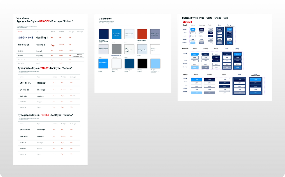
DESIGN SYSTEM
Make cohesive and consistent UI decisions
When I joined the team, the design system was not fully established. I built button components in various styles, states, shapes, and sizes, creating a better layout for team members and developers. This effort was aimed at ensuring design consistency for the survey pages as well as the entire website
DESIGN HAND-OFF
Bridging the gap between cross-functional teams
At the same time, I created instructions for certain specifications and micro-interactions for developers. For example, navigation tab of next page won't become active until users finish all questions on the current page. We discussed and resolved technical issues together.
.png)
User Testing and Final Design
How did I validate our design decisions?
USABILITY TESTING
Unveiling insights for user-centric design
To validate the design and test the prototype, I conducted usability testing for desktop with 10 patient users in- person who would usually visit healthcare platforms.

USER FEEDBACK
Lessons learned from usability testing


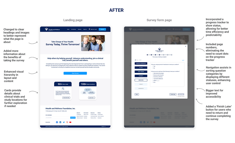
FINAL DESIGN
Before & After comparison

PROTOTYPING
Creating more simple and reliable user interfaces
Further Steps
What is the reflection and fulture development?
LEARNING
Key Takeaways
Conduct A & B Testing
From user testing, some feedback is valuable but not sufficient to support the design decision. Therefore, we'll need to conduct more testing, like A/B testing, and gather more data from users before making significant changes.
Integrate User and Business Needs
Balancing the complexities between user requirements and business objectives is essential. I analyzed and optimized the best solutions to ensure our design decisions effectively address both aspects.
Collaborate Across Disciplines
This kind of project often requires collaboration across multiple disciplines, including healthcare professionals, designers, developers, and legal experts. I learned the value of teamwork and diverse perspectives in creating a successful product.
FUTURE STEPS
How could I make it better?
To Involve More Users in Quantitative Testing
After the survey pages are launched, we need to engage more patient users nationwide to conduct user survey testing for this design. Users may encounter issues that were not identified during the initial design and testing phases.
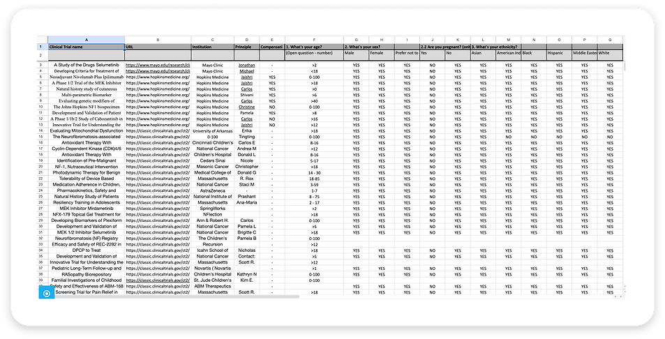
To Develop a Clinical Trial Resource Page
We need to create a resource page listing all matching clinical trials, including details of institution names, clinical trial names, and whether or not there is compensation. Here is the draft of resource page.
To Gain Impact Upon Delivery
The survey pages are in the process of implementation currently and will be delivered soon; we can focus on setting up prospective Key Performance Indicators (KPIs) that will help evaluate its effectiveness once it is launched. Here are some KPIs/metrics that could be relevant:

I hope you found insight into my design approach and thinking process enjoyable.